 Inspiration
Trend Colors for Furniture Film 2026: Inspiration and Practical Tips for Modern Interior Design
Designing interiors with furniture films continues to gain importance—especially when it comes to flexibility, customization, and quick makeover options. For 2026, new trend colors are emerging that can set accents in both living spaces and offices or commercial properties. This article provides an overview of the expected color trends, explains selection criteria, and showcases concrete application examples.
Color Trends for Furniture Film 2026: What to Expect?
The trend colors for furniture films in 2026 are inspired by current developments in interior design. The focus is on natural, earthy tones, soft pastels, and modern accent colors. Especially popular are:
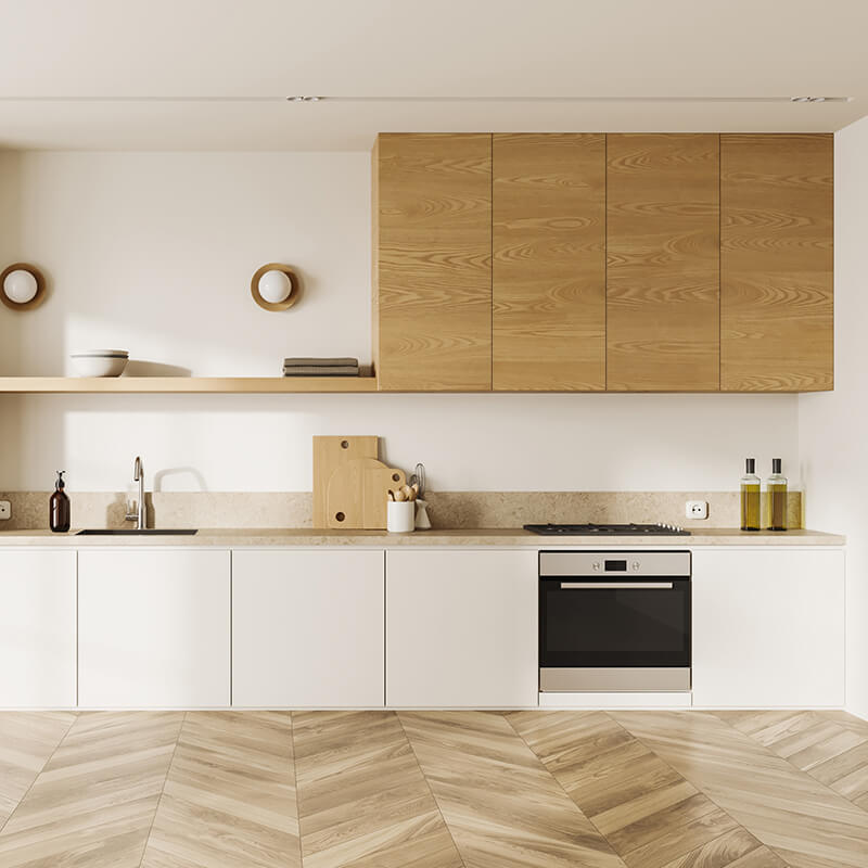
- Warm sand and beige tones: These colors create a calm, inviting atmosphere and are highly versatile.
- Muted greens: Sage, olive, or eucalyptus bring a sense of nature into interiors and have a balancing effect.
- Cool blue shades: From misty blue to deep sea—blue tones provide freshness and modernity, especially in work environments.
- Soft terracotta and brick red: These shades add warm accents without being overpowering.
- Elegant greys: Timeless and neutral, ideal for minimalist interior concepts.
- Pastel accent colors: Delicate rose and lilac tones offer subtle pops of color that blend harmoniously.
The Colored Furniture Film from myfolie offers a wide selection of matte shades inspired by these trends and can be customized to individual needs.
Application Examples: Using Trend Colors Effectively
Office and Commercial Spaces
In modern offices, trend colors are used strategically to define specific areas or reinforce brand identity. Warm beige tones on desks or shelves create a pleasant working atmosphere. Green furniture films can bring a relaxed vibe to break rooms or meeting spaces. For reception areas, accent colors like terracotta or blue attract attention without being overwhelming.
Find more inspiration for designing work and commercial spaces on the Interior Films for Shopfitting, Office & Commercial Design page.
Living Spaces
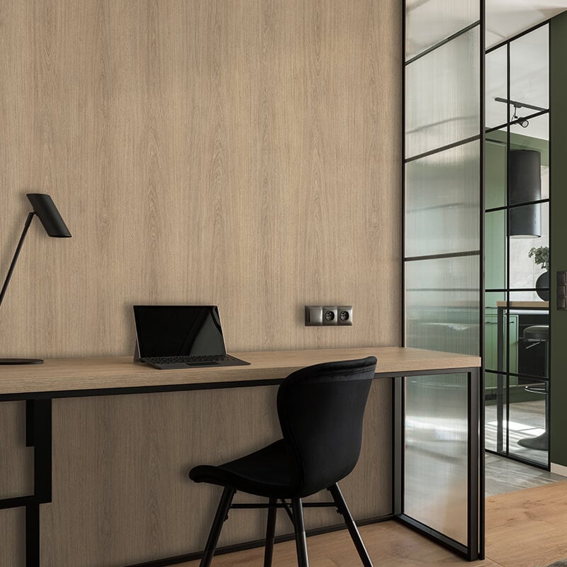
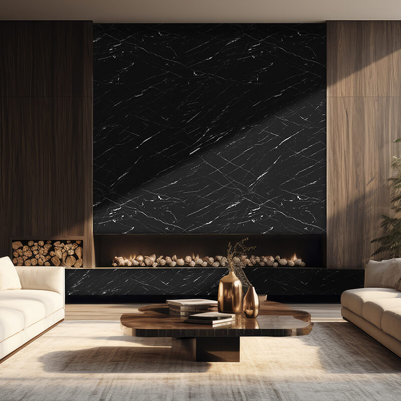
In private homes, furniture films in trend colors offer an easy way to visually upgrade pieces like dressers, cabinets, or kitchen fronts. Pastel tones are especially suitable for bedrooms or children's rooms, while muted colors like grey or green create a calming effect in living rooms. Combinations with Wood-Effect Furniture Film or Marble-Effect Furniture Film also allow for exciting contrasts.
Combination Options and Integration into Interior Styles
The choice of the right furniture film should be guided by the desired interior style:
- Scandinavian: Light, natural colors like sand, beige, and pastel blue emphasize the minimalist look.
- Industrial: Greys, dark blue or green tones, and combinations with wood or concrete effects suit the urban style.
- Modern-minimalist: Clear, neutral colors like white, grey, and black create a tidy overall impression.
- Boho and Retro: Warm earth tones, terracotta, and soft rose shades bring vibrancy and individuality.
When combining different films, it is recommended to choose no more than three color tones to achieve a harmonious overall look. The FAQ on Colors offers further tips on color selection and combination.
Selection Criteria for Trend Color Furniture Films
- Area of use: Depending on the level of use and environment, the film should be robust and easy to maintain.
- Surface: Matte or textured films look especially high-quality and are less sensitive to fingerprints.
- Installation: Self-adhesive films are usually easy to apply and can be removed without residue.
- Customization: Many films can be ordered to size and cut individually.
More information on selection and application can be found in the myfolie Blog.
Conclusion and Outlook
The trend colors for furniture film 2026 offer a wide range of options for creating spaces that are both individual and contemporary—whether in private or commercial settings. Natural, calming tones are at the forefront, complemented by targeted accent colors. Combining them with wood or marble effects opens up additional design possibilities. Those who keep up with color trends early can set deliberate accents and flexibly adapt interiors to new design trends.
Further information on colors, materials, and application can be found in the FAQs on Colors and on the respective product pages.
Products
Related products


Colored Furniture Film
Self-adhesive furniture film with textured surface for furniture, c...
€36.95


Marble Effect Furniture Film
Self-adhesive furniture film with textured surface for furniture, c...
€34.95

Matte Adhesive Film for Interiors
For temporary indoor lettering and surface design: matte look, calm...
€7.95

Adhesive Film for Indoor & Outdoor Use
A universal film for lettering and surface design: flexible in appe...
€8.95